LIGHT AND COLOUR IN THERAPEUTIC SPACE
Why do some spaces “feel” more comfortable than others? When at first they appear to be the same….
This can be demonstrated in multi-level facilities where when the lift doors open one immediately “feels” a sense of the mood on that floor…
The key here is most likely to do with colour, light and acoustics.
At Pulse Architecture we are acutely aware of how these subtle nuances affect the spaces we move through and work in every day.
We are careful to select the most appropriate colour and light spectrums that both offer comfort and lighting conditions that facilitate patient examination.
There are several scientific and executive factors that are required to be considered, below is a summary of a few key points:
Attention to the psychology of colour and the effect that colour has on the mental and physical moods of patients, visitors, and staff.
Consideration of ethnic culture and the symbolism that colour has.
Provide appropriate visual contexts for staff to not only reduce mental fatigue but to also increase productivity levels.
Investigate the effects of each colour on the efficiency of natural and artificial lighting in a space, both day and night.
Investigate the effects of combining each colour spectrum to create positive and negative spaces in order to assist reading the dimension, distance and magnitude of each space.
The colour chosen for walls, floors, and ceilings will certainly affect the harmonious aesthetic of the interior space. It also has a significant impact on the patient's mood and well-being. These same effects have an impact on caregivers and visitors.
While the colour chosen can make a room appear larger, smaller, wider, narrower, deeper, taller, brighter or warmer. It always needs to feel comfortable, safe and fresh.
Some psychologists see the effects of colours as brief and/or temporary. In response, it should be stated that even if these effects are temporary, they cannot be neglected by Designers. Specifically, in Healthcare settings, even a few moments of distraction from a situation - may be considered a success. At Pulse we consider these choices and specify accordingly.
Below we touch on a few colour characteristics which may assist you next time you are thinking about re-decorating or selecting a furniture or updating floor finishes etc;
RED
Warm sumptuous RED is a symbol of love, warmth, joy and strength. It is most suitable for sparking strong emotions, creating excitement and even provoking anger. Colours that fall within the red spectrum, are identified as warm colours and range from warm emotions to anger. Hence extreme caution should be exercised in applying this colour in environments where calm contemplation is required.
Studies have shown that red increases blood pressure and heart rate. It increases brain wave activity and can stimulate adrenalin concentrations in the blood stream and so is recommended to be used in high activity areas where stimulation is required. Although this colour enhances confidence, it is recommended to be avoided by persons with neurological problems as it causes frustration.
Good for Architects, not great for Medical applications!

Geelong Library and Heritage Centre - Designed by ARM Architecture
BLUE
Blue is one of the cool colours that often associates as the favourite colour that men like very much!
This colour and the wide range of its compounds implies a sense of calm, a symbol of order, peace and security. Blue in some people creates a sense of sadness and introversion and sometimes indifference. This colour is anorexic and reduces heart rate and heat.
In some people, blue also has a relaxing, and soothing effect on the nervous system, so it is useful in treating insomnia. It can be used in Emergency facilities, psychiatric wards and waiting rooms.
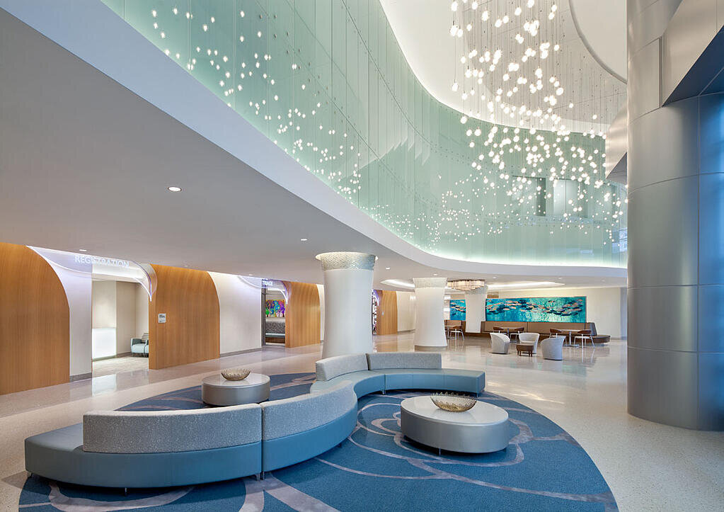
AdventHealth Hospital for Women - Designed by HKS Architects
GREEN
While considered cold, it symbolizes nature, health, youth and growth. For Pulse we consider Green as warm and specify greens with some yellow colour spectrum. It is a symbol of peace and happiness also reduces stress and relieves fatigue.
Green reduces central nervous system activity and helps people feel calm. It can also lower blood pressure, respiration and heart rate.
At Pulse, wSt Vincent's Private Hospital, Toowoomba - Designed by Pulse Architecture.e try our best to incorporate this colour into our designs. Pulse Architecture apply green leafed wall papers and planted wall scapes. Fortunately, artificial plants have improved in realistic quality and have become reasonably cost-effective, especially if one considers maintenance lighting and irrigation of the luxury of the unbeatable real thing!
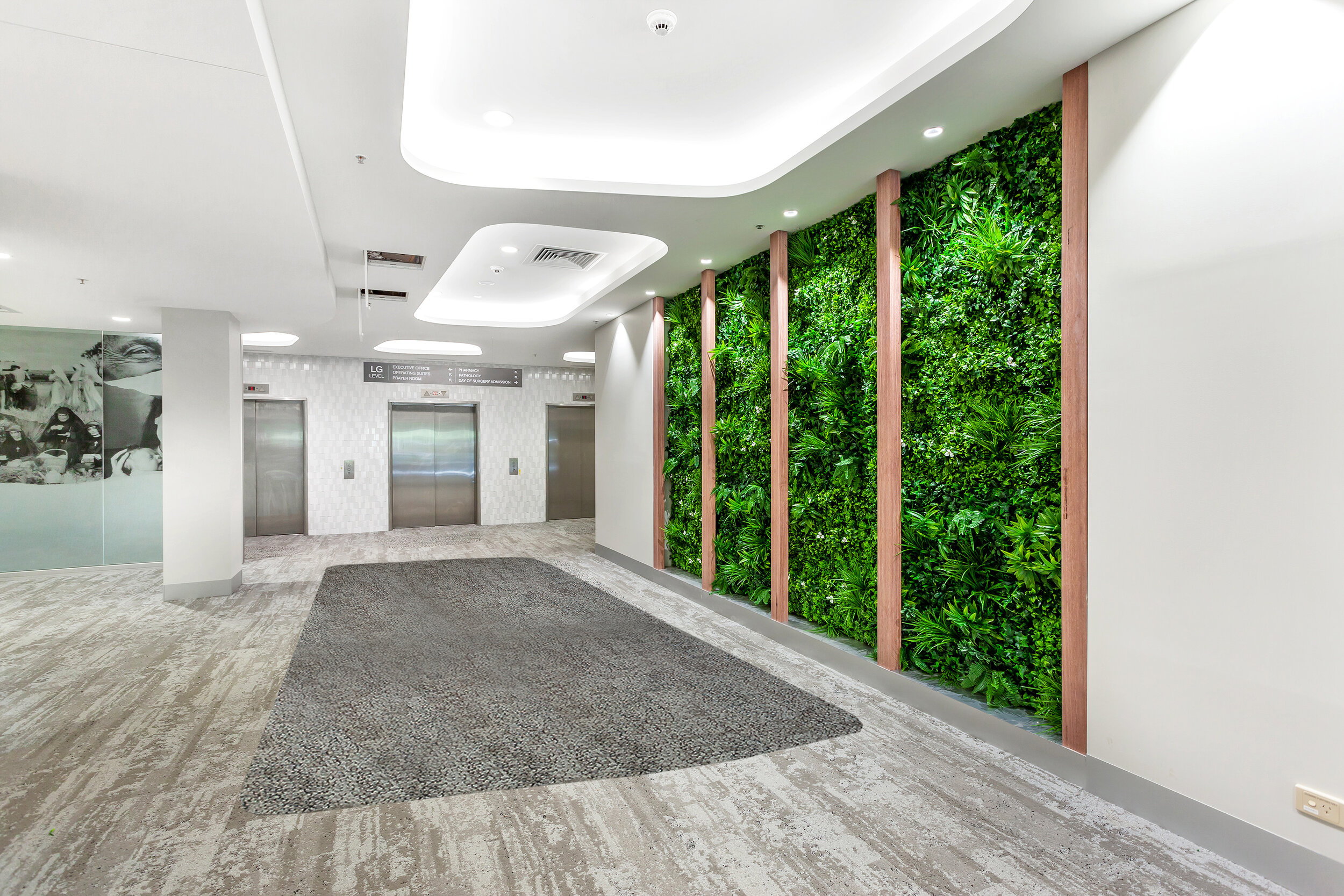
St Vincent’s Private Hospital, Toowoomba - Designed by Pulse Architecture.
YELLOW
It is part of the warm colour spectrum and due to the large amount of light reflected in it, it tends to cause fatigue. Yellow is a good colour to draw ones attention but has the potential to creates a sense of resentment and anger. Yellow is an appetizing colour due to an increase in ones metabolic rates.
Pulse Architectures hot tip! Redecorate patient dining rooms with a good colour combination including Yellow. Colour vending machine walls in golden sunshine yellow and introduce some at kiosks and hospital cafes.

The Adelaide Health & Medical Sciences (AHMS) - Designed by Lyons Architecture
ORANGE
The orange – The Pulse Architecture Logo – a combination of yellow & red – it exudes energy…
Since this colour creates a feeling of excitement, enthusiasm and warmth, it is the perfect colour to attract more attention – ideal for Pulse Architecture!
This colour can be used in places where the patient or medical staff needs to be recharged. However, very similar to other warm colours (Yellow and Red), the orange colour should be used sparingly with a variety of other colour combinations.

The Shirley Ryan Abilitylab, Chicago - Designed by HDR in association with Clive Wilkinson Architects.